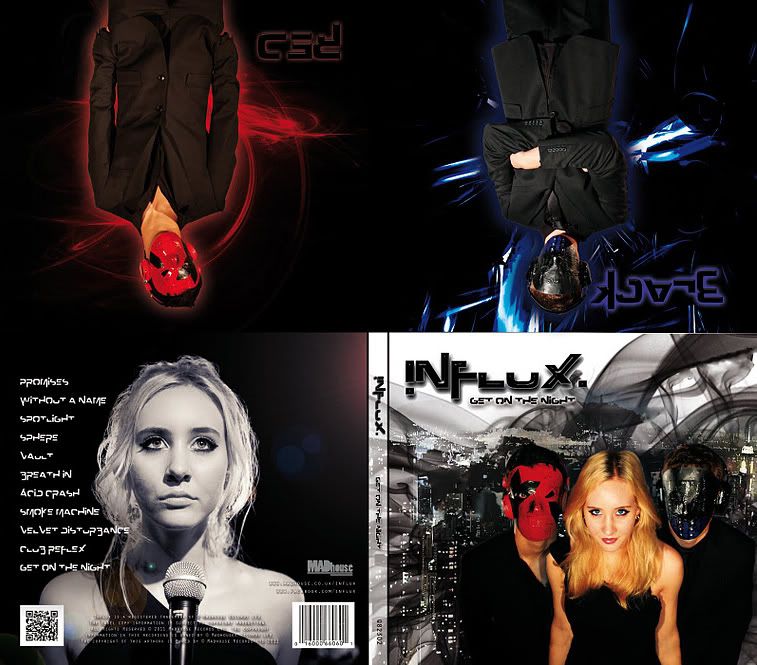
What are the typical features of an album cover?
- The artist name will be situated somewhere on the front, generally quite easy to see.
- The album name is usually next to the artist name but in smaller writing.
- The focal pint is always around the center of the cover.
- If the artist is on the cover of the album they are usually next to the name and very prominant.
- The text on the cover is in a prominant and font that helps to brand the artist.
- Albums without the artist on the cover will generally have a picture of the artist somewhere on the album and on the cover will be and arty picture with links to the artist some being very abstract.
- Bar code and copyright information on the back.
- Track names and sometimes time codes on the back cover.
- Dates and companies/ record labels also on the back cover.
I would catagorise them into 2 main groups with then more specific groupings below them. One group would be artist on the cover with any style which could then be split into covers with artist in a photographic sense such as Sean Paul with some minipulation and then an absrtact or arty form of the artist such as the Bonkers and Calvin Harris albums.
The other catagory would be an art style that represents the album and artist which is generally abstrct setting an inticing scene to the viewer. That would then be split into the catagories of abstract, photography and people which can overlap. For example photography applies to the Bloc Party and Blur albums, abstract to the Bassment Jaxx and Oasis albums and people applies to the Muse, Nivana and Blink 182 albums.
What are the functions of album covers?
The main function of course is to market the album and artist through attracting and targeting the relevant audience. The main way the covers do this is through being different and prominant so they will stand out in record store shelve and people are going to be more curious about picking an album up if the cover is attractive or raises questions like 'why did the artist choose this cover?'.

This is Canadian band Billy Talent's first album named after the band.
Deconstruction
Images used: The layout is fairly simple as is the colour sheme for the front cover as is the back. The colours of red, cream and black on the front make it stand out especially with red being a dominant colour that will stand out on the shelves. They are a Canadian band so there may be a link between the colour scheme on the front and thier nation. The design shows the band walking towards the viewer away from a splat of some sort in the background that could be interpretaded as a hole or the sun and many other things raising questions from the audience. The colour scheme on the back is also simple of just orange, yellow and black which also helps to make the album stand out. The image is a highly saturated and colourised photograph of the band having a chat which advertises the band.
Text used: The font is the same throughout in terms of track names and band name which reflects the punky genre of the band which slightly off centre and twisted lettering which is very subtle. This bold and clear lettering helps the album to stand out and appeals to the right audience and is typical of a début album. The back and front covers of this above album and all their aspects help to advertise the album and artist and help to make it stand out on the shelf for a passer by to investigate.


No comments:
Post a Comment